Understanding the Role of Color in Interior Design
Color plays a pivotal role in interior design, serving not only as a means of aesthetic appeal but also as a powerful psychological tool that influences mood and perception. The choice of color in interior spaces can determine how a room feels and ultimately shapes the experiences of its occupants. For instance, warm colors such as reds and oranges tend to evoke feelings of warmth and comfort, making spaces feel more inviting and intimate. Conversely, cooler colors like blues and greens can impart a sense of calmness and tranquility, promoting relaxation.
Moreover, the strategic use of color accents can alter the perception of spatial dimensions. Light colors can make a space feel larger and more open, while darker hues may create a cozy atmosphere but can also make a room feel more confined. This is particularly relevant in smaller environments where maximizing space perception is essential. By incorporating color thoughtfully, designers can enhance the functionality of spaces, guiding occupants’ experiences according to the intended use of each area.
In addition to these psychological and spatial considerations, color can also affect how we interact with our environments. It has the capacity to draw attention to specific features and create focal points within a room. Accents of vibrant colors can enliven otherwise neutral spaces, invigorating the overall atmosphere without overwhelming it. For example, a bold geometric print pillow or a vivid piece of artwork can serve as a striking color accent, seamlessly integrating character while maintaining balance.
Understanding these elements is vital for those looking to incorporate color accents effectively. By being mindful of the psychological impacts, perceptions of space, and aesthetic purposes of color, one can create harmonious interior spaces that not only appeal visually but also resonate on a deeper emotional level. This foundational knowledge arms designers with the tools to navigate the intricate interplay between color, space, and mood in their projects.
Choosing a Color Palette
Selecting a harmonious color palette is an essential step in enhancing interior spaces while ensuring that the overall design remains cohesive. A well-chosen color palette can transform a room, injecting character and style without overwhelming the senses. To begin this process, utilizing a color wheel can be particularly helpful. This tool illustrates the relationships between colors and can guide you in identifying complementary hues.
Understanding color relationships is crucial in developing a palette that flows seamlessly. The primary colors—red, blue, and yellow—serve as the foundation for secondary colors, which are formed by mixing two primary hues. For instance, mixing blue and yellow yields green, a secondary color. When creating your color palette, consider using primary colors as the base, supplemented with secondary colors to add depth. Finally, determining your accent colors is vital; these are typically bolder tones or shades that provide contrast and visual interest without overwhelming the primary color scheme.
When harmonizing colors, it is advisable to focus on the ’60-30-10′ rule. This design principle suggests that 60% of the room should feature a dominant color, 30% should be allotted to a secondary color, and the remaining 10% can highlight accent colors. This strategy helps to balance the overall visual appeal, ensuring that no single color steals the spotlight. Additionally, consider the mood you wish to evoke in your space—warm colors can create a cozy atmosphere, while cool tones tend to provide a calming effect. Embracing variations of shades and tones can also enrich your interior design, leading to a sophisticated and engaging environment.
Incorporating Color Accents: Techniques and Strategies
Incorporating color accents into interior design can significantly enhance the character and depth of a space. One effective technique is the use of art. Selecting vibrant or thought-provoking artwork can instantly draw attention and add personality to a room. When choosing art, consider the existing color palette; a piece that complements rather than clashes with your primary colors will create a harmonious visual experience. Additionally, varying the size and placement of artwork can also contribute to a dynamic arrangement, creating balance and flow.
Textiles serve as another vital element in the introduction of color accents. This can range from cushions and throws to area rugs and curtains. Opting for textiles in bold hues or intricate patterns can infuse life into neutral spaces. It is essential, however, to maintain a connection between various textiles used throughout the room. This ensures that different elements work cohesively instead of competing for attention. Utilizing different textures can also add an extra layer of interest, drawing the eye to various spots within the interior.
Furniture pieces like chairs, ottomans, or tables in accent colors serve to anchor a space visually. A colorful armchair against a muted wall can become a focal point, while colorful furniture accessories, such as side tables or lamps, can subtly enhance the overall aesthetic without overwhelming it. When incorporating colored furniture, it is crucial to consider the proportion of color used; too many bold pieces can lead to a chaotic atmosphere. Aim for a balanced approach, combining different elements to create a cohesive look.
Lastly, small accessories like vases, picture frames, and decorative bowls allow for flexibility in introducing color. These items can be easily swapped out or updated according to trends or personal preferences, providing an effortless way to freshen up the room. By applying these techniques thoughtfully, one can successfully incorporate color accents into their interior design while ensuring a harmonious overall presence.
Evaluating Color Intensity and Saturation
Color intensity and saturation are pivotal elements in interior design that significantly influence the mood and character of a space. Understanding these concepts is crucial when aiming to incorporate color accents without overwhelming the overall decor. Color intensity refers to the brightness or dullness of a color, while saturation defines the purity of a color in relation to its shades of gray. By evaluating these factors, one can select colors that not only stand out but also harmoniously blend with existing elements in a room.
When choosing colors for your interior, it is essential to consider the intensity. A high-intensity color, such as a vibrant red or electric blue, can quickly become the focal point of a room. However, excessive use of such colors may cause visual fatigue or create an uninviting atmosphere. Instead, opt for colors with moderate intensity that can still provide a punch without overwhelming the viewer. This approach allows for the introduction of bold hues while maintaining a sense of balance and cohesion within the space.
Saturation plays a complementary role in this process. Colors with high saturation are typically vivid and eye-catching, making them ideal for creating accents. For example, a saturated green cushion can enliven a neutral sofa, drawing attention without dominating the entire room. In contrast, more muted colors, which contain higher proportions of gray, can serve as a calm backdrop that enhances bolder accents. By mixing saturated colors with those featuring lower saturation levels, designers can achieve dynamic visual interest while ensuring that the overall design remains cohesive.
Thus, evaluating color intensity and saturation becomes a strategic endeavor in interior design, aiding in the selection of colors that both complement and enhance the existing decor. This balance is essential to adding character to a space while avoiding visual overload.
Accent Walls: A Focused Approach to Color
Accent walls have gained prominence as an effective method of integrating color into interior spaces without overwhelming the overall design. This approach allows homeowners and designers to introduce vibrant hues that can highlight specific areas, making them focal points within a room. By emphasizing a single wall, one can create dynamism in spaces such as living rooms, bedrooms, or home offices, while preserving a calm and cohesive aesthetic throughout the rest of the area.
The primary benefit of utilizing an accent wall lies in its ability to enhance the character of a room with minimal effort. A well-chosen color can complement existing furniture and decor, adding depth and warmth without necessitating a complete renovation. Some popular color choices for accent walls include rich jewel tones, soft pastels, or bold primary colors. To avoid clashing with surrounding elements, one should carefully consider how the selected color interacts with the rest of the space. For instance, pairing a deep blue accent wall with neutral tones in furniture can create a balanced and inviting atmosphere.
Beyond solid colors, patterns and textures can also contribute significantly to the accent wall’s visual appeal. Techniques such as stenciling, wallpapering, or employing textured finishes add layers to the design, further enhancing its uniqueness. However, maintaining balance is crucial; it’s advisable to limit the use of complex patterns to one area, ensuring that the overall ambiance remains tranquil and focused. Incorporating artwork or decorative objects that harmonize with the wall color can lead to an even more cohesive design.
Ultimately, accent walls present a strategic opportunity to infuse personality into interior spaces, allowing color to speak volumes while keeping the overall composition in check. By carefully selecting the right hue or pattern, one can achieve a stylish and sophisticated look that reflects personal tastes.
Color Accents in Different Rooms
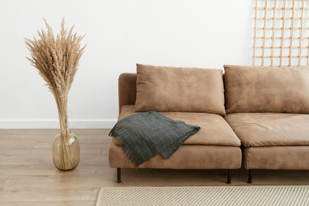
Incorporating color accents into various rooms requires an understanding of the unique characteristics of each space. The living room, often a central gathering area, can benefit from a combination of neutral tones and vibrant hues. Consider using accent pillows or throws in rich, bold colors to create focal points on neutral sofas. An eye-catching piece of art can serve as a great conversation starter and anchor the room’s color palette.
In the kitchen, color accents can breathe life into what is typically a functional space. Consider painting a feature wall in a refreshing shade, such as a muted green or soft aquamarine, which can evoke a sense of calm and cleanliness. Accessories like colorful cookware or bright dish towels can offer bursts of color without overwhelming the overall aesthetic. Open shelving allows for displaying colorful dishware, infusing vibrancy into a predominantly utilitarian area.
Bedrooms serve as personal retreats, and color accents here should promote relaxation. Soft pastel tones for bedding or a feature wall can create a serene ambiance. Incorporating darker, richer colors in bedspreads or curtains can imbue a sense of coziness and warmth while maintaining an inviting atmosphere. Adding colorful artwork or decorative elements can also reflect personal taste without being visually overpowering.
Bathrooms, often overlooked as a space for color, can also benefit from strategic accents. Introduce color through towels, shower curtains, or decorative accessories like vases and soap dispensers. Opt for colors that promote a spa-like feel, such as soft blues and greens, to enhance tranquility. A feature wall in a bold tile pattern can also make a statement while remaining practical and stylish.
Seasonal Color Changes: Refreshing Your Interior
Incorporating seasonal color trends into your interior design can significantly enhance the ambiance of your living space, providing a refreshing backdrop that aligns with the changing moods of each season. By adopting a strategic approach, homeowners can seamlessly transition their color accents throughout the year, creating a dynamic atmosphere that embodies vitality and warmth.
One effective method to achieve this is by using a rotating palette based on seasonal themes. For instance, spring often evokes feelings of renewal, which can be captured through pastels and vibrantly colored accents, such as soft greens, light pinks, and sunny yellows. Introducing these colors can be as simple as substituting throw pillows, wall art, or decorative accessories. Such adjustments not only brighten up the space but also reflect the essence of spring.
As summer approaches, consider amplifying the brightness with bolder hues that mirror the exuberance of the season. Deep blues, vibrant oranges, and bright whites can invigorate interiors, reminiscent of beaches and sunny skies. Again, this does not necessitate a complete overhaul; instead, swapping out items like table runners or curtains can transform the space while keeping it in harmony with the outdoor environment.
With the arrival of fall, shifting toward warm, earthy tones can create a cozy atmosphere. Rich reds, burnt oranges, and golden yellows are synonymous with autumn and help foster a welcoming environment ideal for gatherings. Simple changes in color accents through decor or artwork can curate this desired feeling, effectively allowing for a seasonal narrative within your home.
Finally, winter’s chill invites a palette of deep greens, rich burgundies, and shimmering metals that evoke a sense of warmth and comfort. Incorporating these shades through accent rugs or festive decorations can create an inviting sanctuary during the colder months. By thoughtfully integrating seasonal colors, homeowners can refresh their interiors, maintaining character without overwhelming the senses.
Cultural Influences on Color Choice
Colors hold symbolic meanings and significance across various cultures, greatly influencing preferences in interior design. For instance, in many Eastern cultures, colors such as red and gold are associated with luck, prosperity, and celebration. A space designed with these vibrant hues is often created to welcome good fortune, making them popular choices for festive occasions. On the other hand, Western cultures might lean towards more subdued palettes like blue and beige, which evoke calmness and tranquility. The preference for these colors can significantly impact how spaces are perceived and experienced.
Moreover, the cultural context can dictate specific color pairings or contrasts that may not resonate in other traditions. For example, the traditional use of white in many Asian cultures symbolizes purity and peace, while in some Western cultures, it can indicate mourning. This divergence illustrates how interior designs are deeply embedded in cultural narratives, emphasizing the importance of understanding one’s background when selecting color accents.
Furthermore, regional climates can also affect color choices influenced by culture. In tropical regions, bright and vivid colors can reflect the surrounding environment, contributing to a lively and inviting atmosphere. Conversely, in colder climates, richer, deeper colors may be preferred to create warmth and comfort. Consequently, integrating cultural influences in color accents can not only make a space visually appealing but also infuse it with meaning and character.
As designers explore color accents in their projects, recognizing these cultural nuances is essential. They must consider the emotional and historical implications of certain colors to create spaces that resonate with personal and communal identity. By doing so, the resulting designs can effectively communicate and celebrate the unique cultural heritage that informs them.
Sustainability and Color: Natural Choices for Accents
Incorporating sustainable choices for accent colors in your interior design can greatly enhance the aesthetic of your home while also taking the environment into consideration. As the demand for eco-friendly solutions continues to rise, it is essential to focus on materials and paints that minimize ecological footprints. Sustainable accent colors can be achieved through a variety of means, including the selection of non-toxic paints, natural pigments, and repurposed materials.
One of the key aspects of sustainable design is the choice of paint. Conventional paints can often contain harmful volatile organic compounds (VOCs), which not only pose health risks upon application but also contribute to air pollution. Instead, choosing low or zero-VOC paints ensures that your home remains healthy without compromising on color vibrancy. Brands that specialize in eco-friendly paints often use natural pigments that are derived from minerals or plant sources, offering a spectrum of shades that can seamlessly fit into your design scheme.
In addition to paints, using sustainable materials for achieving color accents is vital. For instance, bamboo and reclaimed wood can be stained in various shades to create decorative elements that are both visually appealing and environmentally responsible. Fabrics made from organic cotton, linen, or hemp are excellent choices for upholstery and decorative items, providing a natural aesthetic while being gentle on the planet.
Moreover, accessorizing with natural finishes or upcycled items can add unique character to your space without excessive waste. Embracing sustainable choices in accent colors not only beautifies your home but also reflects a commitment to the environment, enhancing the overall appeal of your living space. By being conscious of material selection and color application, homeowners can create a harmonious balance between personal style and environmental responsibility.